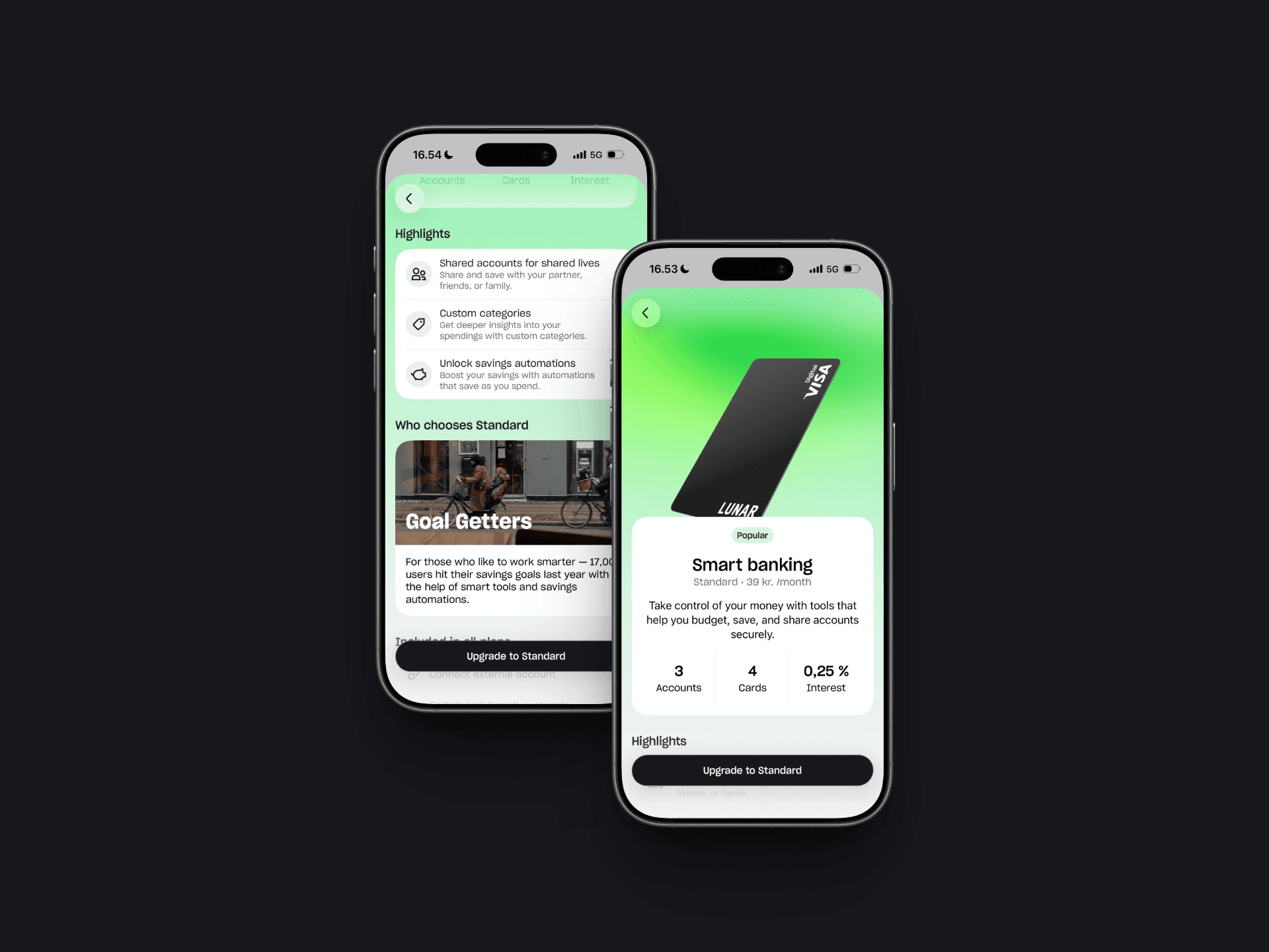
Plan Selector
Plan Selector
Plan Selector
Digital Product
Year
2025
Client
Lunar
Around 80% of new customers chose Lunar’s free Light plan, while the business needed to increase paid-plan sign-ups. The value of paid plans was not clear enough, and choosing the free option felt like the easiest decision. The challenge was to help customers understand, compare, and choose the banking plan that best matched their needs.
The Plan Overview experience makes the value of each plan clear, helping users feel confident in their choice and trust that a paid plan is worth paying for. The experience brings key differences, relevant benefits, and pricing into one considered decision journey rather than asking customers to piece the information together themselves.
Plan Overview: Highlights the key differences and value proposition for each plan at a glance, so users can quickly compare their options side by side.
Plan Detail Pages: Surface the features research showed users valued most and used to make their decisions, making the benefit of each plan easier to understand.
In-App Comparison: Replaces an awkward web-view handoff with a clear, native comparison table that lets users compare inclusions side by side without leaving the app.
Experimentation Framework: Creates an ongoing way to test how plan positioning and visual emphasis affect customer choice, beginning with Light as a trial and later highlighting Standard.
Impacts: When Standard was visually highlighted, plan selection rose from 8.3% to 30.7%, a 263% increase. Checkout price increased by 75% and the share of users choosing any paid plan grew by 165%, from 12.9% to 34.2%. The drop-off in applications and change in Unlimited selection were negligible, making this a clear net positive. Standard is now highlighted for all new consumer users.
Role: User research, UX Lead, content strategy